A couple of weeks ago, I wrote a small guide to understand Sass lists. I hope you’ve read it and learnt things from it!
Anyway, a couple of days ago I stumbled upon a comment in a Sass issue listing a couple of advanced Sass functions to deal with lists. I found the idea quite appealing so I made my own function library for for this. In my opinion, it is always interesting to go deeper than "it just works", so here is a short blog post to explain my code.
Selecting values from list
First and last
Let’s start with something very simple: two small functions to target first and last elements of a list. I don’t know for you, but I don’t really like doing nth($list, length($list)). I’d rather do last($list).
$list: a, b, c, d, e, f;
$first: first($list);
$last: last($list);
Nice, isn’t it? Of course these functions are ridiculously simple to write:
@function first($list) {
@return nth($list, 1);
}
@function last($list) {
@return nth($list, length($list));
}
Since all values are also considered as single-item lists in Sass, using both functions on a single-element list will obviously returns the same value.
Last index of value x
Sass already provides a index() function to retreive the index of a given value in a list. It works well but what if the value is present several times in the list? index() returns the first index.
Good. Now what if we want the last one?
$list: a, b, c, d z, e, a, f;
$first-index: index($list, a);
$last-index: last-index($list, a);
$last-index: last-index($list, z);
I made two versions of this function: in the first one, the code is simple. In the second one, the code is a little dirtier but performance should be better.
@function last-index($list, $value) {
$index: null;
@for $i from 1 through length($list) {
@if nth($list, $i) == $value {
$index: $i;
}
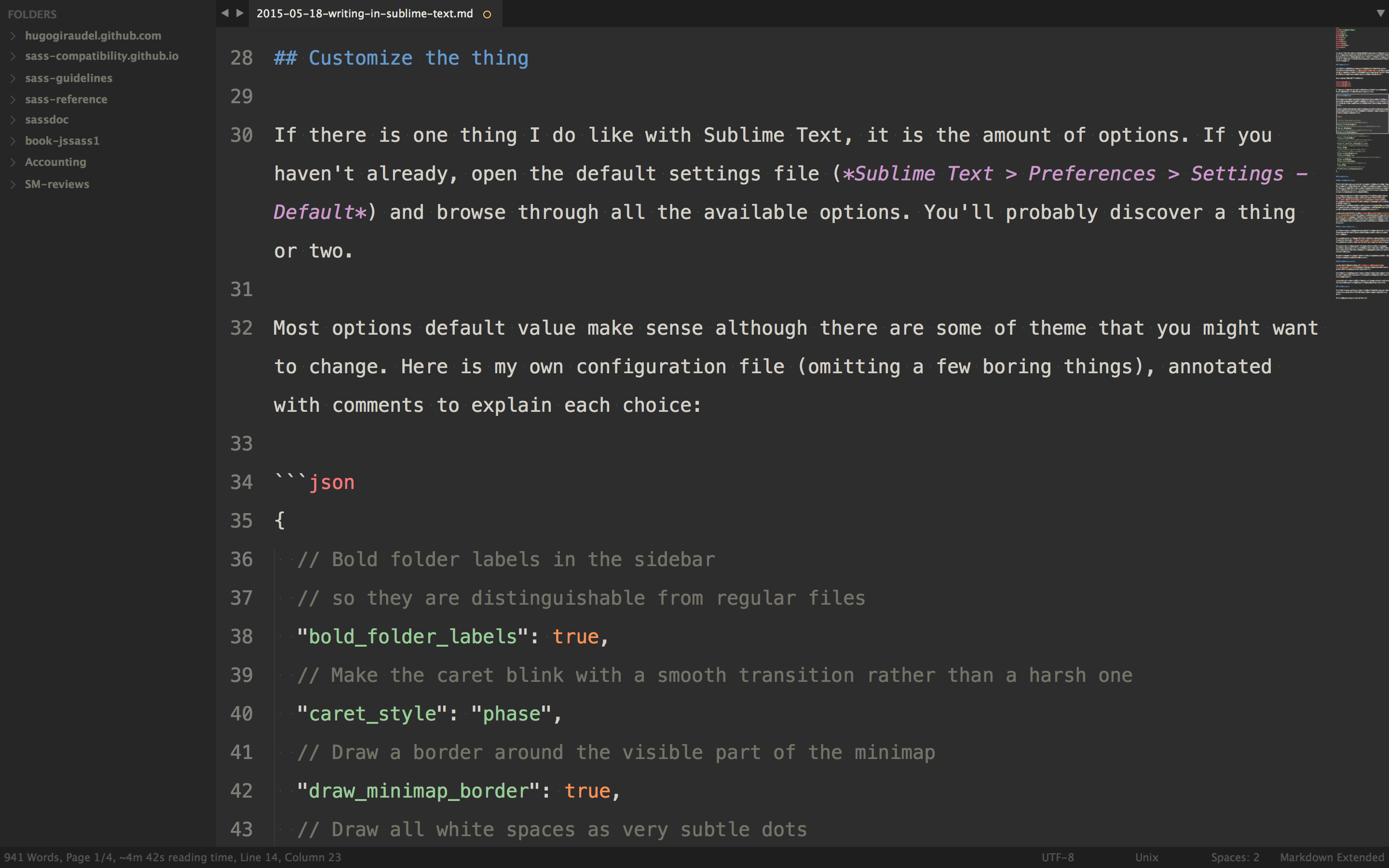
}
@return $index;
}
@function last-index($list, $value) {
@for $i from length($list) * -1 through -1 {
@if nth($list, abs($i)) == $value {
@return abs($i);
}
}
@return null;
}
The second version is better because it starts from the end and returns the first occurence it finds instead of looping through all the items from the start.
The code is a little ugly because as of today, Sass @for loops can’t decrement. Thus, we have to use a ugly workaround to make the loop increment on negative value, then use the absolute value of $i. Not cool but it works.
Adding values to a list
Prepending value to list
You already know Sass comes with a built-in function to add values to a list called append(). While it does the job most of the time, there are cases where you need to add new values at the beginning of the list instead of the end. Thus a new prepend() method.
$list: b, c, d, e, f;
$new-list: prepend($list, a);
$new-list: prepend(
$list,
now i know my a
);
As you can see, the signature is the same as the one for the append() function. Now, let’s open the beast; you’ll be surprised how simple this is:
@function prepend($list, $value) {
@return join($value, $list);
}
Yup, that’s all. join() is a built in function to merge two lists, the second being appended to the first. Since single values are considered as lists in Sass, we can safely join our new value with our existing list, resulting in prepending the new value to the list. How simple is that?
Inserting value at index n
We can append new values to a list, and now even prepend new values to a list. What if we want to insert a new value at index n? Like this:
$list: a, b, d, e, f;
$new-list: insert-nth($list, 3, c);
$new-list: insert-nth($list, -1, z);
$new-list: insert-nth($list, 0, z);
$new-list: insert-nth($list, 100, z);
$new-list: insert-nth($list, zog, z);
Now let’s have a look at the function core:
@function insert-nth($list, $index, $value) {
$result: null;
@if type-of($index) != number {
@warn "$index: #{quote($index)} is not a number for `insert-nth`.";
} @else if $index < 1 {
@warn "List index 0 must be a non-zero integer for `insert-nth`";
} @else if $index > length($list) {
@warn "List index is #{$index} but list is only #{length($list)} item long for `insert-nth'.";
} @else {
$result: ();
@for $i from 1 through length($list) {
@if $i == $index {
$result: append($result, $value);
}
$result: append($result, nth($list, $i));
}
}
@return $result;
}
Here is what happens: we first make some verifications on $index. If it is strictly lesser than 1 or greater than the length of the list, we throw an error.
In any other case, we build a new list based on the one we pass to the function ($list). When we get to the $index passed to the function, we simply append the new $value.
Replacing values from list
We’re good with adding new values to a list. Now what if we want to change values from a list? Like changing all occurences of a into z? Or changing the value at index n? Sass provides nothing native for this, so let’s do it ourself!
Replacing value x
$list: a, b, r, a, c a, d a, b, r, a;
$new-list: replace($list, a, u);
$new-list: replace($list, a, u, true);
As you can see, the function also deals with nested lists if you pass the 4th optional argument to true. At index 5 and 6, we have 2 nested lists where a has been replaced by u in the second example.
@function replace($list, $old-value, $new-value, $recursive: false) {
$result: ();
@for $i from 1 through length($list) {
@if type-of(nth($list, $i)) == list and $recursive {
$result: append(
$result,
replace(nth($list, $i), $old-value, $new-value, $recursive)
);
} @else {
@if nth($list, $i) == $old-value {
$result: append($result, $new-value);
} @else {
$result: append($result, nth($list, $i));
}
}
}
@return $result;
}
Getting a little more complicated, doesn’t it? Don’t worry, it’s not that hard to understand. For every element in the list (nth($list, $i)), we check whether or not it is a nested list.
- If it is and
$recursive is set to true, we call the replace() function again on the nested list (recursive style!).
- Else, we check if the element is strictly the same as the value we want to replace (
$old-value).
- If it is, we append
$new-value.
- Else we append the initial value.
And there we have a recursive function to replace a given value by another given value in a list and all its nested lists.
Replacing value at index n
Now if we want to replace a value at a specific index, it’s a lot simpler.
$list: a, b, z, d, e, f;
$new-list: replace-nth($list, 3, c);
$new-list: replace-nth($list, 0, c);
$new-list: replace-nth($list, -2, c);
$new-list: replace-nth($list, -10, c);
$new-list: replace-nth($list, 100, c);
$new-list: replace-nth($list, zog, c);
As you can imagine, it works almost the same as the insert-nth() function.
@function replace-nth($list, $index, $value) {
$result: null;
@if type-of($index) != number {
@warn "$index: #{quote($index)} is not a number for `replace-nth`.";
} @else if $index == 0 {
@warn "List index 0 must be a non-zero integer for `replace-nth`.";
} @else if abs($index) > length($list) {
@warn "List index is #{$index} but list is only #{length($list)} item long for `replace-nth`.";
} @else {
$result: ();
$index: if($index < 0, length($list) + $index + 1, $index);
@for $i from 1 through length($list) {
@if $i == $index {
$result: append($result, $value);
} @else {
$result: append($result, nth($list, $i));
}
}
}
@return $result;
}
I think the code is kind of self explanatory: we check for errors then loop through the values of the $list and if the current index ($i) is stricly equivalent to the index at which we want to replace the value ($index) we replace the value. Else, we simply append the initial value.
Edit (2013/08/11): I slightly tweaked the function to accept negative integers. Thus, -1 means last item, -2 means second-to-last, and so on. However if you go like -100, it throws an error.
Removing values from list
Hey, it’s getting pretty cool. We can add values to list pretty much wherever we want. We can replace any value within a list. All we have left is to be able to remove values from lists.
Removing values x
$list: a, b z, c, z, d, z, e, f;
$new-list: remove($list, z);
$new-list: remove($list, z, true);
Same as for the replace() function, it can be recursive so it works on nested lists as well.
@function remove($list, $value, $recursive: false) {
$result: ();
@for $i from 1 through length($list) {
@if type-of(nth($list, $i)) == list and $recursive {
$result: append($result, remove(nth($list, $i), $value, $recursive));
} @else if nth($list, $i) != $value {
$result: append($result, nth($list, $i));
}
}
@return $result;
}
I bet you’re starting to get the idea. We check each element of the list (nth($list, $i)); if it is a list and $recursive == true, we call the remove() function on it to deal with nested lists. Else, we simply append the value to the new list as long as it isn’t the same as the value we’re trying to remove ($value).
Removing value at index n
We only miss the ability to remove a value at a specific index.
$list: a, b, z, c, d, e, f;
$new-list: remove-nth($list, 3);
$new-list: remove-nth($list, 0);
$new-list: remove-nth($list, -2);
$new-list: remove-nth($list, -10);
$new-list: remove-nth($list, 100);
$new-list: remove-nth($list, zog);
This is a very easy function actually.
@function remove-nth($list, $index) {
$result: null;
@if type-of($index) != number {
@warn "$index: #{quote($index)} is not a number for `remove-nth`.";
} @else if $index == 0 {
@warn "List index 0 must be a non-zero integer for `remove-nth`.";
} @else if abs($index) > length($list) {
@warn "List index is #{$index} but list is only #{length($list)} item long for `remove-nth`.";
} @else {
$result: ();
$index: if($index < 0, length($list) + $index + 1, $index);
@for $i from 1 through length($list) {
@if $i != $index {
$result: append($result, nth($list, $i));
}
}
}
@return $result;
}
We break down the list ($list) to build up the new one, appending all the items except the one that was on the index we want to delete ($index).
Edit (2013/08/11): same as for the replace-nth function, I tweaked this one to accept negative integers. So -1 means last item, -2 means second-to-last, and so on.
Miscellaneous
We did a lot of important things already, so why not ending our series of functions with a couple of miscellaneous stuff? Like slicing a list? Reversing a list? Converting a list into a string?
Slicing a list
$list: a, b, c, d, e, f;
$new-list: slice($list, 3, 5);
$new-list: slice($list, 4, 4);
$new-list: slice($list, 5, 3);
$new-list: slice($list, -1, 10);
In the first draft I made of this function, I edited $start and $end value so they don’t conflict with each other. In the end, I went with the safe mode: display error messages if anything seems wrong.
@function slice($list, $start: 1, $end: length($list)) {
$result: null;
@if type-of($start) != number or type-of($end) != number {
@warn "Either $start or $end are not a number for `slice`.";
}
@else if $start > $end {
@warn "The start index has to be lesser than or equals to the end index for `slice`.";
}
@else if $start < 1 or $end < 1 {
@warn "List indexes must be non-zero integers for `slice`.";
}
@else if $start > length($list) {
@warn "List index is #{$start} but list is only #{length($list)} item long for `slice`.";
}
@else if $end > length($list) {
@warn "List index is #{$end} but list is only #{length($list)} item long for `slice`.";
}
@else {
$result: ();
@for $i from $start through $end {
$result: append($result, nth($list, $i));
}
}
@return $result;
}
}
We make both $start and $end optional: if they are not specified, we go from the first index (1) to the last one (length($list)).
Then we make sure $start is lesser or equals to $end and that they both are within list range.
And now we’re sure our values are okay, we can loop through lists values from $start to $end, building up a new list from those.
Question: would you prefer a function slicing from index n for x indexes to this (so basically $start and $length)?
Reverse a list
Let’s make a small function to reverse the order of elements within a list so the last index becomes the first, and the first the last.
$list: a, b, c d e, f, g, h;
$new-list: reverse($list);
$new-list: reverse($list, true);
As you can see, by default the function do not reverse nested lists. As always, you can force this behaviour by setting the $recursive parameter to true.
@function reverse($list, $recursive: false) {
$result: ();
@for $i from length($list) * -1 through -1 {
@if type-of(nth($list, abs($i))) == list and $recursive {
$result: append($result, reverse(nth($list, abs($i)), $recursive));
} @else {
$result: append($result, nth($list, abs($i)));
}
}
@return $result;
}
As we saw earlier, @for loops can’t decrement so we use the negative indexes workaround to make it work. Quite easy to do in the end.
Convert a list into a string
Let’s finish with a function I had a hard time to name. I first wanted to call it join() like in JavaScript but there is already one. I then thought about implode() and to-string(). I went with the latter. The point of this function is to convert an array into a string, with the ability to use a string to join elements with each others.
$list: a, b, c d e, f, g, h;
$new-list: to-string($list);
$new-list: to-string($list, '-');
The core of the function is slightly more complicated than others because there is a need of a strictly internal boolean to make it work. Before I explain any further, please have a look at the code.
@function to-string($list, $glue: '', $is-nested: false) {
$result: null;
@for $i from 1 through length($list) {
$e: nth($list, $i);
@if type-of($e) == list {
$result: $result#{to-string($e, $glue, true)};
} @else {
$result: if(
$i != length($list) or $is-nested,
$result#{$e}#{$glue},
$result#{$e}
);
}
}
@return $result;
}
*Note: recursivity is implied here. It would make no sense not to join elements from inner lists so you have no power over this: it is recursive.
Now, my very first draft returned something like this a-b-c-d-e-f-g-h-. With an extra hyphen at the end.
In a foolish attempt to fix this, I added a condition to check whether it is the last element of the list. If it is, we don’t add the $glue. Unfortunately, it only moved the issue to nested lists. Then I had a-b-c-d-ef-g-h because the check was also made in inner lists, resulting in no glue after the last element of inner lists.
That’s why I had to add an extra argument to the function signature to differenciate the upper level from the nested ones. It is not very elegant but this is the only option I found. If you think of something else, be sure to tell.
Shift indexes of a list
This function comes from Ana tudor. It aims at shifting the indexes of a list by a certain value. It may be quite tricky to understand.
$list: a, b, c, d, e, f;
$new-list: loop($list, 1);
$new-list: loop($list, -3);
Hopefully examples will make the point of this function clearer. The code isn’t obvious in the end, so I’ll just leave it here.
@function loop($list, $value: 1) {
$result: ();
@for $i from 0 to length($list) {
$result: append($result, nth($list, ($i - $value) % length($list) + 1));
}
@return $result;
}
Thanks a lot for the input Ana!
Final words
I guess that’s all I got folks! If you think of anything that could improve any of those functions, be sure to tell. Meanwhile, you can play with this pen.
]]>


