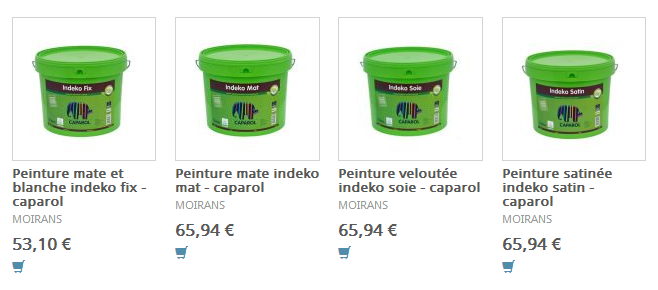
At work, many of our pages present one or more collection of items, like products, shops, or whatever. It’s basically a list of thumbnails, with a title and a location and/or a price. When you click on it, it leads you to the page related to the item. We call this the elements component (we could have called it thumbs-list or something but that doesn’t matter).
Now, this is the core of a lot of other components. For instance, we have a component featuring top products, with the same list of items but in a better wrapper with a heading, a “see more” link, a large left border for some visual impact and stuff. It’s just an example but the elements component is used in at least 3 to 4 other components of our architecture.

Until now, no big deal. Au contraire, it looks pretty nice! DRY code, component-based architecture. Nothing but the best so let’s move on.
We also have a couple of different layouts:
- one column: the content spreads across the whole page
- two columns: there is a sidebar on the right, with ads and related links
- three columns: there is a sidebar on the left, gathering all search filters
And now, here is the issue: depending on the component and the layout, we want to control the number of items to be displayed on a single row. For instance, in a one-column layout, we could spread to 6 items per row. 4 or 5 in a two-columns layout. 3 in the three-columns layout.
And all this has nothing to do with responsive design, yet. So you can imagine what a nightmare it can be when you have to make this component adapt not only to its context but to the screen size, from 300px to 1200px.
The problem with media queries
Media queries are not a solution. At least not in this case. Media queries are great when we want to adapt the layout to the screen size. This is where they really kick off. But that’s not what we want. I mean, first we want to be able to make our component work great in all situations at a single screen width, we’ll see responsive issues after.
And when switching from 1 to 2 to 3 columns, the viewport’s width has absolutely no impact on anything. It’s always the same. We don’t give a shit about the viewport’s size at the moment, we need to know how much space is available for the component depending on the layout used (and in a lesser extend the meta-component used).
Moving on to element queries
Element queries are not part of any CSS Specification. They basically do not exist as of today. There are a couple of JavaScript-based polyfills involving various syntaxes, but there is still no draft for a native support.
Yet, element queries would be so much better than media queries. The more I think about it, the more I fell like we almost wouldn’t need media queries if we had element queries. Working a site/application as a collection of components you put together like LEGOs not only makes more sense but also allows you to handle responsive design at a module level instead of a macro overview.
That’s why I’ve decided to give a serious go at element queries at work. I came across quite a couple of versions, all of them looking real good:
- CSS Element Queries from Marcj
- Element Queries from Tyson Matanich
- EQ.js from Sam Richards
I decided to set up on the last one which looks slightly better than the others. Also I like Sam Richards, that’s enough for me. Anyway, all we have to do to make it work — aside from including the script — is adding a data-eq-pts attribute to the component, listing breakpoints as a map.
<ul
  class="component"
  data-eq-pts="small: 300, medium: 500, large: 700, huge: 900"
>
  <!-- … -->
</ul>
Then when a min-width is matched, the element can be selected using an attribute selector data-eq-state matching the mapped keyword. For instance .component[data-eq-state="small"] when the component is between 300 and 499px wide.
I have designed a little test case (you might want to test it on CodePen directly and resize the screen):
See the Pen cfdf5410e622f1e5f41035232de4260c by Kitty Giraudel (@KittyGiraudel) on CodePen.
The first collection (top) is the 1-column layout, the second one (middle) is when we got a sidebar and the last one (bottom) is when we got both the filter bar and the sidebar. As you can see, the number of elements per row adapts to the available width to the component (not the screen size).
Final thoughts
I truely believe future of responsive web design lay somewhere around Element Queries. They are not just convenient, they are essential to build a DRY and maintainable architecture.
However, they still come up with a couple of pitfalls like infinite loops and non-sense declarations. Imagine you tell a component to have a width of 399px when it is 400+ pixels large. This is brainfuck. This is probably because of such things element queries are still not natively implemented anywhere.
But I hope we might get to it. Some day.