Edit : I published a small React hook for that on npm as a standalone library.
I recently shared some thoughts on Twitter about an idea Mike Smart and I had a few years back, while working on the new N26 mobile signup flow: detecting the user’s dominant hand.
The app has been rebuilt since and I cannot find old screenshots, but at the time registering for N26 consisted on filling a form that displayed one field at a time. So you’d have a dozen steps, and each view consisted of a title, a description, one or more related fields, and a confirm button at the bottom to move to the next step.
On the address confirmation step however, we had 2 side-by-side buttons at the bottom: one primary button to confirm your address and move on, and one secondary button to edit your address and go back to the previous step.
What we wanted was for the primary button to be on the side of the dominant hand. So on the right for a right-handed user, and on the left for a left-handed user.
Prototyping with JavaScript
The way we thought we could detect the user’s dominant hand was by recording and scoring taps based on whether they occur on the left- or right-side of full-width buttons. We assumed (perhaps incorrectly) a right-handed user would tap buttons towards the right side of the screen, while a left-handed user would tap buttons between the left edge and the center.
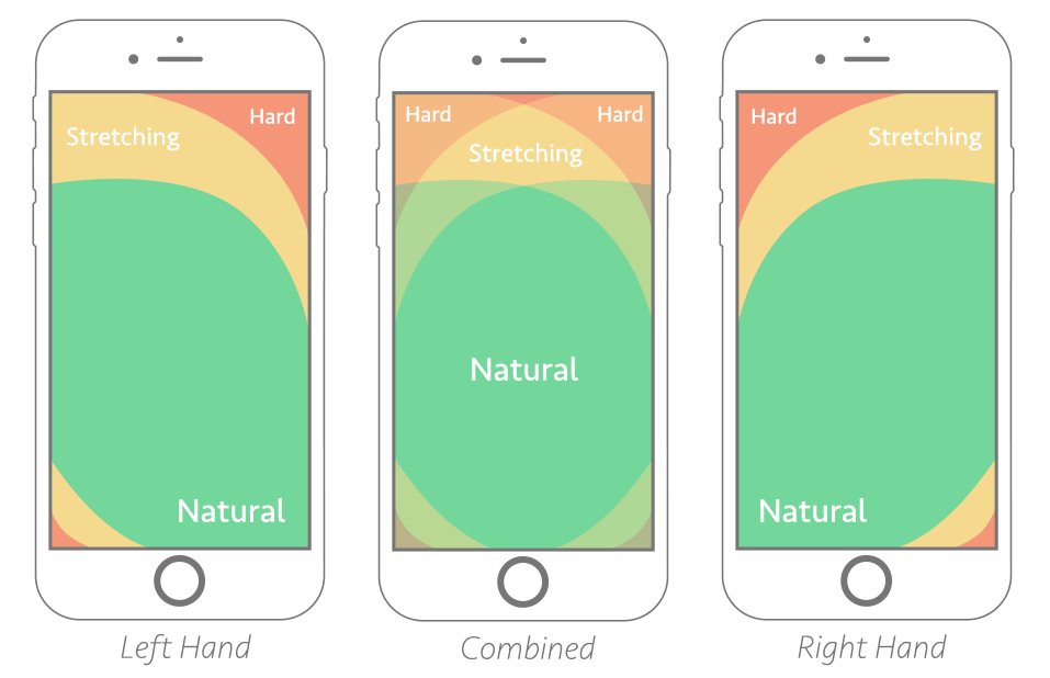
We wrote a script that would intercept taps happening on elements considered full-width and check on which side they occurred, and give them a score between -1 (left edge) to +1 (right edge). As we recorded more taps, we would make that score more and more accurate.
I dug and found the code we wrote. However, it was a higher-order component and used React classes, so I refreshed it to use hooks. Here is what it looks (sorry for React, I don’t have the energy to move it to plain ol’ JavaScript):
// Returns a number between -1 and +1 to convey the guessed dominant hand, with
// -1 being left side and +1 being right side.
const useDominantHandScore = ({
  // Arbitrary maximum screen width to compute score for; anything beyond that
  // is considered not a mobile device and thus discarded
  maximumScreenWidth = 500,
  // Threshold above which an element is considered full-width (80% by default)
  // and can be a candidate for tap recording
  fullWidthThreshold = 0.8,
} = {}) => {
  const viewportWidth = useViewportWidth()
  const [tapScore, setTapScore] = React.useState(0)
  const [tapCount, setTapCount] = React.useState(0)

  const handleTap = React.useCallback(
    event => {
      const consideredFullWidth = viewportWidth * fullWidthThreshold
      const targetWidth = event.target.offsetWidth || 0

      // If not on mobile (not a great check but heh) or not a click event or
      // not a tap on a full-width element, do nothing
      if (viewportWidth > maximumScreenWidth) return false
      if (event.clientX === 0 && event.clientY === 0) return false
      if (targetWidth < consideredFullWidth) return false

      setTapCount(count => count + 1)
      setTapScore(score => score + getTapPosition(event))
    },
    [viewportWidth, maximumScreenWidth, fullWidthThreshold]
  )

  React.useEffect(() => {
    document.addEventListener('click', handleTap)

    return () => {
      document.removeEventListener('click', handleTap)
    }
  }, [handleTap])

  return tapScore / tapCount || 0
}

function getTapPosition(event) {
  const percentage = Math.round(
    ((event.clientX - event.target.offsetLeft) / event.target.offsetWidth) * 100
  )

  // Convert the percentage (0–100) to a number on the -1/+1 scale
  return (percentage - 50) / 50
}
You can play with the demo on CodeSandbox. Be sure to resize the window so the browser panel is at most 500 pixels wide, since it’s the threshold we use for detection.
About reliability
Something we have done back then (although I couldn’t figure out how or where) is bringing in a concept of reliability. In that regard, there are two things to consider:
- How many taps have been recorded? The results are likely to be skewed or incorrect when only a few taps have been registered. The more taps, the more relevant the outcome. So that’s certainly something the code should reflect, either by providing a reliability metric, or by returning 0 until a certain threshold has been reached.
- How relevant were the registered taps? If all the taps occur around the middle, you end up with a binary outcome which might not reflect the reality of the situation. Perhaps considering a “dead zone” around the center where taps are not recorded (or recorded at 0) could help with that. Essentially discard the -0.2 to +0.2 range or something.
Imagining a browser setting
In the Twitter thread, I expanded on how I think it could be interesting to have this as an operating system feature, akin to the reduced motion mode or the light/dark switch. For instance, the reMarkable tablet asks for the user’s dominant hand during the setup process.
Once it’s an OS setting, it can be conveyed by the browser via a media query. Let’s say, “prefers-dominant-hand”. It would have 3 values: left, right and no-preference. From there, you could adjust your designs based on the value of this media query:
.FloatingButton {
  position: fixed;
  top: 0;
  right: 0;
}

/* This is not a real thing; it’s only for demonstration purposes */
@media (prefers-dominant-hand: left) {
  .FloatingButton {
    left: 0;
  }
}
Potential pitfalls
In the original thread, I reflected on the fact that left and right are notions CSS is trying to navigate away from, preferring directional properties (e.g. margin-inline-start instead of margin-left or flex-end instead of flex-right).
Holger thus suggests imagining start and end as values to the potential media query instead, which could mean left/right OR right/left depending on the context (LTR or RTL). So LTR + right thumb = start, RTL + right thumb = end, and so on.
On another note, Tim Severien chimed in suggesting that we might not want to adapt our interfaces based on arbitrary user traits and instead provide the option for our users to adjust settings to suit their needs.
A bit nitpicky here, as it’s a mere naming thing, but I generally find adapting based on user traits troublesome as they’re full of biases. I’m a left-handed writer but ambidextrous smartphone user.
Similarly we don’t adapt UI based on vision, but remove the assumptions and allow users to choose light/dark preference, I’d adapt navigation on navigation side preference. I guess that also removes the complexity of RTL.
Regardless, it’s definitely fun idea. I’m curious to learn how designers would deal with this. For example, some designers avoid floating buttons to overlap other items. I guess the setting would add a new challenge and opportunity to get creative, which is fun!
— Tim Severien on Twitter
Kilian Valkhof also mentioned how having the ability to register arbitrary media queries would be great. The browser would then provide a built-in interface to tweak these settings, which can then be accessed back with media queries.
Imagine an API that lets sites register arbitrary media features and the browser then exposes a UI for them automatically. 🤩
It would even make known media features like prefers-color-scheme better (with a browser UI toggle) and make customization more discoverable and easier.
— Kilian Valkhof on Twitter
For instance, let’s imagine authoring this code snippet:
// This is not a real thing; it’s only for demonstration purposes
CSS.registerMedia({
  name: 'prefers-dominant-hand',
  syntax: 'start | end | no-preference',
  initialValue: 'no-preference',
})
The browser would then provide a native interface for the user to define their dominant hand (if they wish to do so). If/when they’ve done that, we can read the updated value with the media query suggested above. Now wouldn’t that be neat? Maybe something for the Web We Want. :)
Kilian expanded on this idea on his own blog since I wrote this article. Be sure to have a read!
Wrapping up
It’s unclear whether dominant-hand design is something worth exploring. It’s been in the back of my head since we played with this late 2016, and I haven’t seen anything about this concept since (or before for that matter). I still wonder whether this is a great idea or a terrible one.
If you’d like to consider it, hit me up. I’d love to see a clean implementation (maybe with a small open-source library?) and the results it yields. I’m sure it would be interesting. ✨