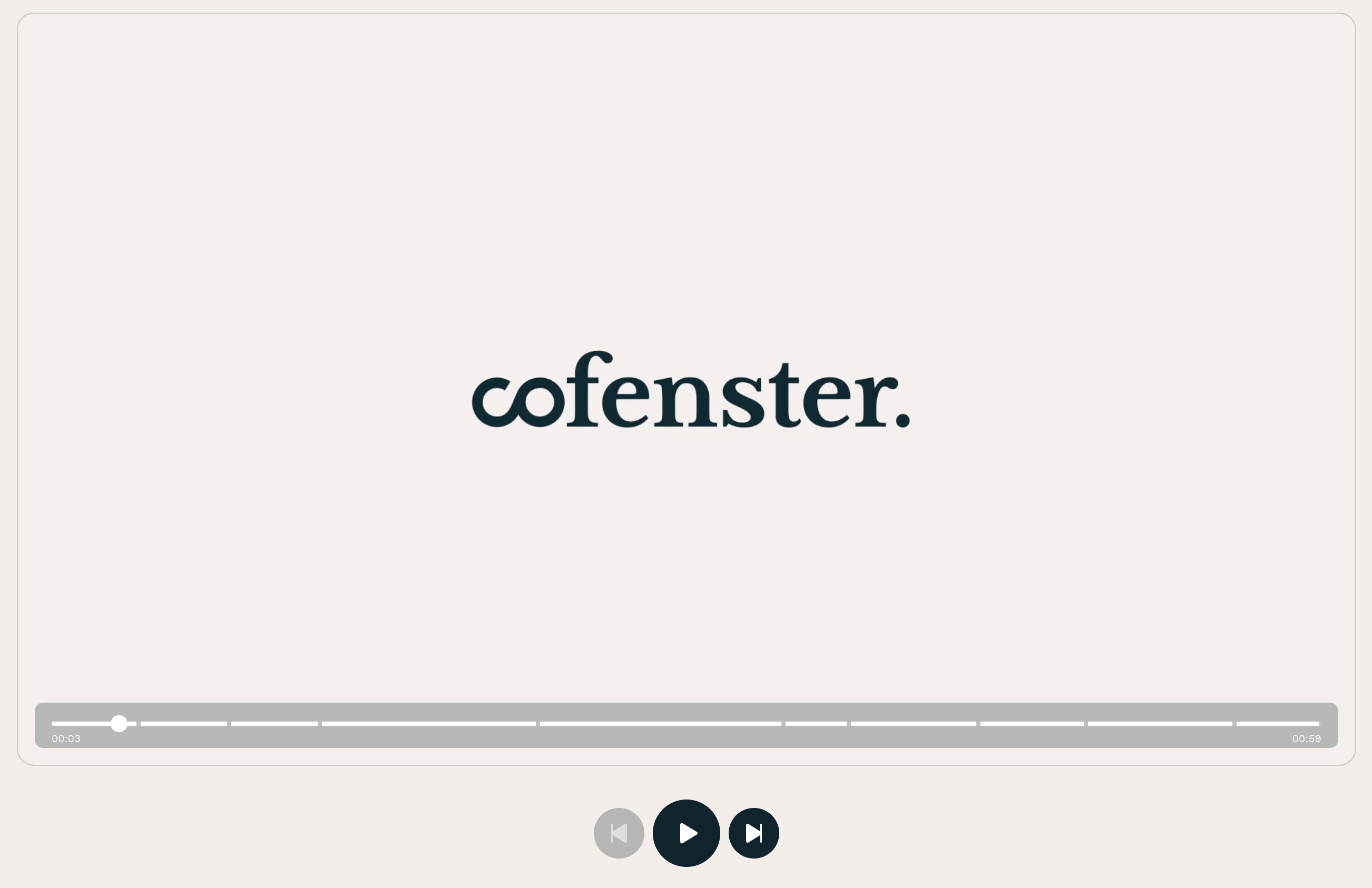
I work at cofenster where we build a video creation platform. To do that, our customers can compose scenes, which we eventually style and stitch together to generate a resulting mp4 video file.
Excuse this lil’ ad!
It helps me pay the bills and keep the site running. 😊
In our live preview editor, we want to display the scenes boundaries in the video player track. A little bit like video chapters on YouTube if you will.

There are certainly plenty ways to build something like that, and I decided to implement it using CSS linear gradients. It was the simplest approach considering the rest of the code.
Concept
Conceptually, it’s not very difficult. We are going to use a CSS linear gradient with hard color stops to indicate each start and stop of a scene.
We have our own video player, which has a track bar styled with CSS. We instruct it to use a certain CSS custom property as background if defined, otherwise a solid color. It could look like this:
.Trackbar {
  height: 10px;
  width: 100%;
  background: var(--preview-scene-markers, white);
}
Generating the gradient
Higher up our DOM/component tree and closer to the data layer, we have our scenes. It’s basically an array of objects that contain the start time and end time of each scene in the video.
We are going to loop over this array of scenes, and for each one, add some color stops to our gradient. Of course, for these stops to be visible, we need to create an artificial gap between 2 scenes: this is what the thickness option does in the code below. It creates an extra strip a few pixel wide, transparent so that the track color doesn’t render there. This is how the gaps are done.
const getTrackMarkers = (scenes, options = {}) => {
  const { trackColor = '#fff', thickness = 4, precision = 2 } = options
  const markers = []
  const totalDuration = scenes.at(-1)?.end
  const halfThickness = `${thickness / 2}px`

  // Return nothing, and not `none`, as we want the default value from the CSS
  // custom property to be applied.
  if (!totalDuration || scenes.length === 1) {
    return
  }

  scenes.forEach(scene => {
    const percent = ((scene.end / totalDuration) * 100).toFixed(precision)

    // Marker start
    markers.push(`${trackColor} calc(${percent}% - ${halfThickness})`)
    markers.push(`transparent calc(${percent}% - ${halfThickness})`)
    // Marker end
    markers.push(`transparent calc(${percent}% + ${halfThickness})`)
    markers.push(`${trackColor} calc(${percent}% + ${halfThickness})`)
  })

  return `linear-gradient(to right, ${markers.join(', ')})`
}
Finally, we can put this in a custom property in some upper container; doesn’t matter too much where and this may be very framework-specific.
const container = document.querySelector('.SomeContainer')
const styles = container.style
const gradient = getTrackMarkers(scenes)

styles.setProperty('--preview-scene-markers', gradient)
Output
The output is pretty verbose though, and gets more and more bloated as the number of scenes increases. For a test project with 8 scenes, we get:
linear-gradient(
  to right,
  #fff calc(6.86% - 2px), transparent calc(6.86% - 2px),
  transparent calc(6.86% + 2px), #fff calc(6.86% + 2px),
  #fff calc(14.00% - 2px), transparent calc(14.00% - 2px),
  transparent calc(14.00% + 2px), #fff calc(14.00% + 2px),
  #fff calc(21.13% - 2px), transparent calc(21.13% - 2px),
  transparent calc(21.13% + 2px), #fff calc(21.13% + 2px),
  #fff calc(38.31% - 2px), transparent calc(38.31% - 2px),
  transparent calc(38.31% + 2px), #fff calc(38.31% + 2px),
  #fff calc(57.63% - 2px), transparent calc(57.63% - 2px),
  transparent calc(57.63% + 2px), #fff calc(57.63% + 2px),
  #fff calc(62.79% - 2px), transparent calc(62.79% - 2px),
  transparent calc(62.79% + 2px), #fff calc(62.79% + 2px),
  #fff calc(72.98% - 2px), transparent calc(72.98% - 2px),
  transparent calc(72.98% + 2px), #fff calc(72.98% + 2px),
  #fff calc(81.47% - 2px), transparent calc(81.47% - 2px),
  transparent calc(81.47% + 2px), #fff calc(81.47% + 2px),
  #fff calc(93.14% - 2px), transparent calc(93.14% - 2px),
  transparent calc(93.14% + 2px), #fff calc(93.14% + 2px),
  #fff calc(100.00% - 2px), transparent calc(100.00% - 2px),
  transparent calc(100.00% + 2px), #fff calc(100.00% + 2px)
);
There are some things we can do to squeeze some bites out:
- Use single-letter custom properties for colors longer than 8 characters long (e.g.
transparent,rebeccapurpleor other longer notations). - Remove the spaces inside
calc()expressions. - Lower the precision to 1 or 0 digit.
At the end of the day, there is only so much we can do though. Linear gradients use a verbose syntax, and we need a lot of color stops to make hard cuts between scenes.
Accessibility
Because it uses CSS, it’s not very accessible on its own. What I mean by this is that one would need to be able to see the track to notice the scene stops; it is not available to screen-readers or keyboard navigation.
However, the scenes can be navigated and browsed separately in our interface, so I believe it to be okay in that state. It’s a rather minor visual hint, which is not required to successful use the editor.
Advanced
There are some interesting things we could do with that feature:
- Use different colors for various scenes, perhaps to highlight their type (image scene vs. video scene vs. text scene or something) or their author.
- Use transparent stops for excluded scenes from the final video.
- And probably some more things I can’t think of. :)
Pssst! I am currently looking for my next job opportunity from March! Read more on LinkedIn. ✨