Pssst! I am currently looking for my next job opportunity for March 2026!
Read more on LinkedIn. ✨
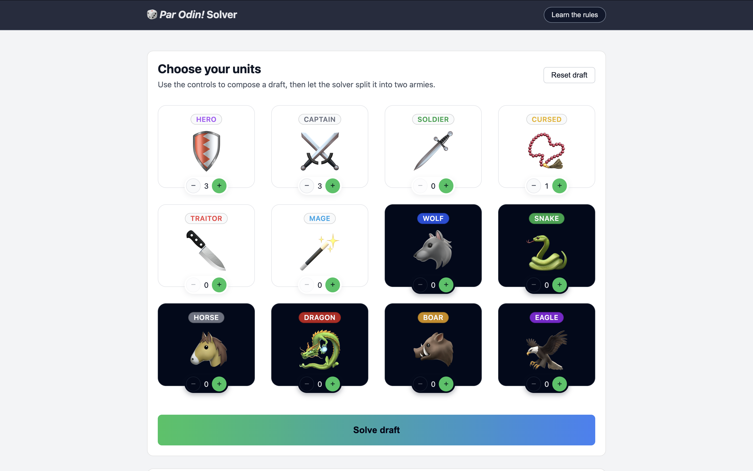
The setup
A while ago, I received the board game called Par Odin!. It’s a little solo puzzle game. You have to divide a draft of 7–9 units into 2 armies of equal strength. Each unit has a value, either static or dynamic, depending on the unit and its surrounding allies.
While the game is fun, I was more interested in writing an automated solution for all 50 challenges from the rulebook. After all, it’s essentially a basic math problem that can be brute-forced. So I wrote a solver in TypeScript.
Just for fun, I also wanted to build a little UI so you can make your own drafts, and run the solver on them. It was also a good opportunity to see what Cursor is like for UI work — as someone who has done frontend for almost 15 years. You can try the game for yourself here.
Getting it off the ground
My initial prompt was intentionally vague:
How about we build a little UI for that game? Maybe you can create your draft, and then solve it?
After exploring all 7 files, Cursor followed up with a few interesting questions for which it provided helpful possible answers:
- What kind of UI would you like for Par Odin? → A small browser-based UI (single page web app) that I can open in a browser.
- If we build a browser UI, do you have a preference for the tech stack? → React + Vite (modern SPA).
After that, it worked on it for a few minutes and spit out a relatively clean dashboard for the game. It took care of the Vite setup, the package.json script, the React implementation, and created the necessary component with all the core logic wiring the existing solver.
It’s worth pointing out that it simply didn’t work to begin with. I had to ask it whether it even attempted to run it, because there were some TypeScript errors, and the browser couldn’t load anything. But after being prompted, it did fix the issues.
Besides this hiccup, the initial bootstrapping was good, even though it stuffed everything in a 500 lines long App.tsx component, but I guess that’s on me for not asking it to create smaller components. I did ultimately instruct it to have each component in a separate folder within its own styles, and it delivered (faster than I could have, may I add).
And even in spite of that, it set up the whole thing so much faster than I could have ever had. Just the initial React + Vite setup would have taken me 10–15 minutes.
Looking into the code
While getting it off the ground was fast and relatively easy, I faced two significant problems:
- It looked woefully unimaginative. You can tell it’s trained to build B2B SaaS dashboards, and anything a bit creative is fundamentally out of reach.
- The code was genuinely not great. Logic was poorly uncapsulated (when it was at all), it often lived in the wrong place, there was no notion of reusability let alone customization.
Creativity is inherently subjective
I wasn’t overly surprised by the fact that Cursor couldn’t come up with something engaging and exciting for a small game interface. First of all, because I didn’t explicitly requested it to do so, but also because it’s ultimately trained on a certain type of software, and is good at reproducing what exists. And what exists is a million dashboards all looking more or less the same.
I don’t think it would be fair of me to expect creativity and art-direction from Cursor. After all, it did come up with something clean and usable in the first place, so the rest is up to me I suppose.
After the first pass, I had an idea of how I wanted it to look and gave it some guidance to get there. It wasn’t incredibly fruitful and required several back-and-forths to get somewhere decent, which I guess is the problem with having a coworker that can neither see nor comprehend the design vision.
Code quality is a mixed bag
More surprising though is that the code was nothing to write home about. In no particular order, here are the things I noticed:
- The default was to stuff virtually everything into a single React component, and a single stylesheet. Not exactly the most manageable strategy.
- There was no concept of logic encapsulation, which is ridiculously easy to do with React hooks. Instead, there were a bunch of
useEffectanduseCallbackin the render of the one component. - There was not a lot of care for maintainability, configuration and customization. For instance, very few CSS custom properties, a lot of hard-coded values, a low amount of component parameterization, and more.
- It fundamentally doesn’t seem to understand the benefit of UI components. Instead of creating reusable, themed components for things like buttons, sections and panels, it just re-outputs the same DOM, and duplicate all the styles.
- It absolutely shat the bed at implementating react-a11y-dialog. It botched the implementation, didn’t follow the documentation, didn’t pull the necessary styles, applied incorrect styles, and once again didn’t consider creating a rusabled dialog component.
So what?
The result is that I had to go over so much of the code to improve or downright fix it, sometimes with Cursor’s help as well (which was doubly infuriating I must say). It took a lot of time, and I genuinely wonder whether I wouldn’t have been faster on my own.
Now, this was admittedly the wrong approach. Instead of leaving it to its own device to build a whole interface, I should have given it narrow and precise tasks such as “Create a reusable Button component that can be themed” or “Build the core application logic in a testable hook using the existing solver.” It’s a good learning for next time.
What I did like is that it did a bunch of bootstrapping for me. With a bit more guidance on what really matters (such as component reusability and logic encapsulation), it would have probably nailed it out of the park and got most of the way there.